SaaS UI Design Trends for 2026: What Is Worth Copying
Not every design trend belongs in a product people use for hours a day. These are the SaaS UI patterns worth adopting in 2026, and the ones to skip.
 Zainab AroojSenior UI/UX Designer
Most design trend lists are written for landing pages. A SaaS product is different: people use it for hours, often every day, to get real work done. The SaaS UI design trends worth copying in 2026 are the ones that make that work faster, clearer, and less tiring. This guide covers the patterns we recommend to clients, the reasons behind each one, and the fashionable ideas we usually leave out of products.
1. Calm interfaces with less on screen
The strongest trend in SaaS design is subtraction. Products are moving away from screens packed with every possible option toward layouts that show the next most likely action and hide the rest until needed.
In practice that means:
- One primary action per screen, visually clear, with secondary actions in menus.
- Progressive disclosure: advanced settings appear when someone asks for them, not by default.
- Fewer colors with clear meaning. If red means "error," it should never also mean "brand."
- More whitespace in dense tools, so related items group together naturally.
Calm does not mean empty. It means every element on the screen has earned its place.
2. Command palettes for power users
A command palette, usually opened with Cmd+K or Ctrl+K, lets users search for any page, record, or action and run it from the keyboard. Developer tools made it popular, and it now appears in project management, CRM, and finance products.
It works because SaaS users become experts. After a few weeks they know what they want and do not want to click through menus to find it. A good palette searches actions as well as pages, shows recent items first, and displays the keyboard shortcut next to each command so people learn them over time.
3. AI features that explain themselves
Almost every SaaS product now has some AI feature. The design question is how to make it trustworthy. The patterns that work:
- Label AI output clearly so users know what was generated.
- Show sources. If the AI summarizes records or documents, link to them.
- Make results easy to edit, retry, or dismiss, and never apply important changes without confirmation.
- Show progress honestly. A short status like "Reading 12 invoices" beats an endless spinner.
The engineering side of this is covered in our guide to adding AI features to an existing web app.
4. Dashboards built around roles
The old SaaS dashboard tried to show everyone everything. The better pattern is a home screen shaped by role: an account manager sees renewals and at-risk customers, a support lead sees queue health, and an owner sees revenue and growth.
Start by listing the three questions each role asks every morning, then design the dashboard to answer those three questions at a glance. Everything else can live one click away.
5. Data tables that do real work
Tables are where SaaS users spend most of their time, and they are getting much better. Strong table design in 2026 includes:
- Saved views with filters, sorting, and columns users can name and share.
- Inline editing for quick changes without opening a separate page.
- Bulk actions with a clear count of what will change.
- Sticky headers and first columns for wide data.
- Sensible density settings, so users can choose compact or comfortable rows.
Small details matter here: right-align numbers, format dates consistently, and keep empty cells visibly empty rather than showing "null."
6. Dark mode as a choice, not a statement
Dark mode is now expected in tools people use for long sessions. The trend is to treat it as a properly designed theme that follows the operating system setting by default, with a manual switch, rather than as the brand's only look.
Design both themes from the same color tokens, and test contrast in each one separately. Colors that pass on white often fail on dark gray.
7. Accessibility built into the design system
Accessibility has moved from "nice to have" to a legal requirement in many markets. The European Accessibility Act now applies to many digital services sold to consumers in the EU, which we explain in our guide to the European Accessibility Act for SaaS.
The practical answer is to bake it into the design system. WCAG 2.2 sets the standard for contrast, visible focus states, target sizes, and more. Build buttons, inputs, and dialogs that meet it once, and every new screen inherits the work.
8. Empty states and micro-interactions with purpose
New users often meet a product with no data in it. A good empty state explains what will appear, shows one clear first step, and sometimes offers sample data. It is one of the cheapest ways to improve onboarding.
Micro-interactions, such as a checkmark when a save succeeds or a row that briefly highlights after an update, confirm that something happened. Keep them short and useful, and respect the user's reduced-motion setting so people sensitive to motion are not affected.
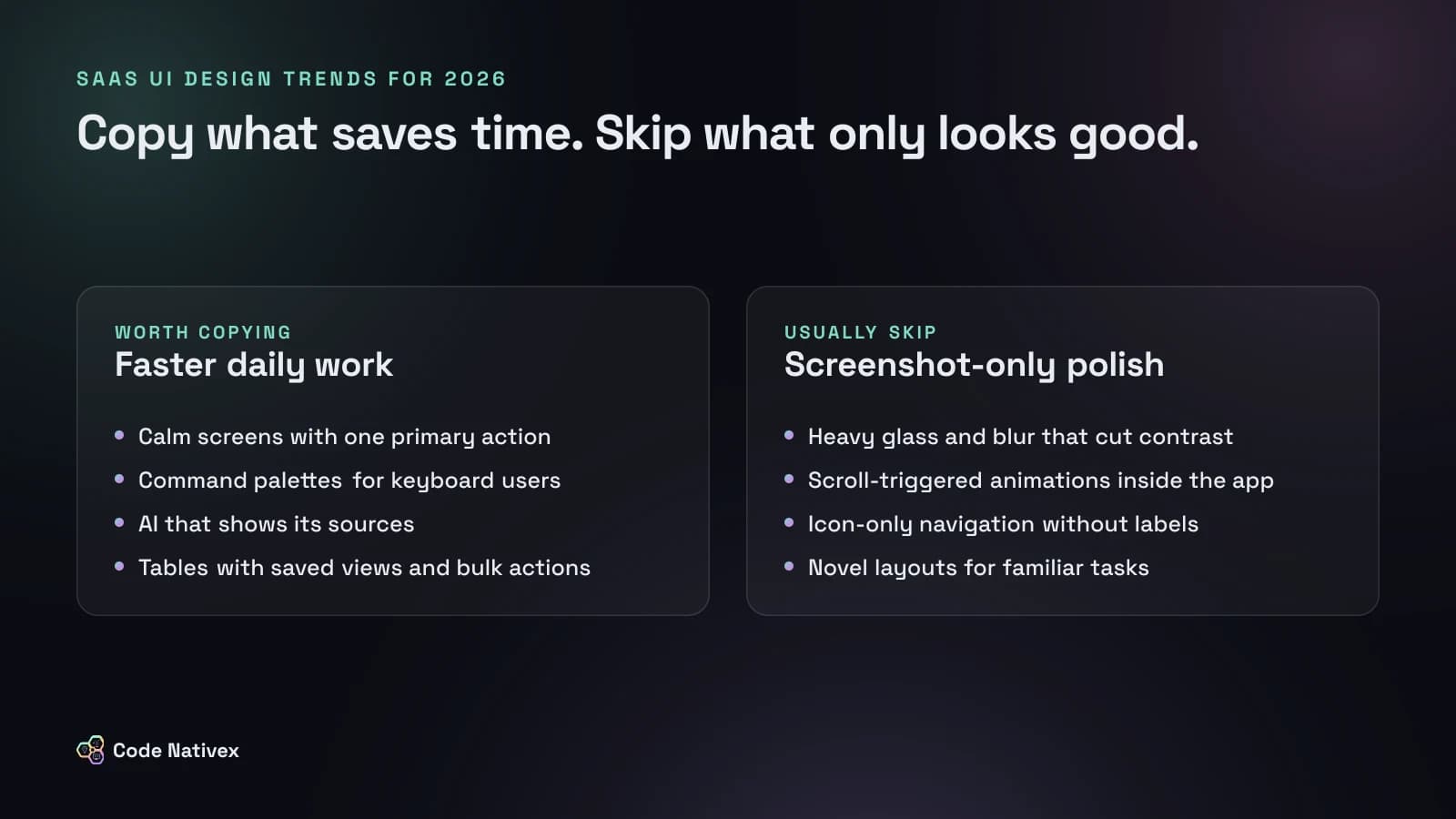
Trends we usually skip in SaaS products
- Heavy glass and blur effects that lower text contrast.
- Scroll-triggered animations inside the app. They belong on marketing pages, if anywhere.
- Icon-only navigation without labels or tooltips.
- Novel layouts for familiar tasks. Settings, billing, and team management should look like users expect.
How we apply this on client projects
We start every product with a design system in Figma, built from tokens that map directly to code, so trends like dark mode and accessible focus states arrive consistently across every screen. You can see the results across our case studies, and our SaaS development service explains how design and engineering work together from discovery to launch.
The bottom line
The SaaS UI design trends that last are the ones that respect users' time: calm screens, faster navigation, better tables, honest AI, and accessibility from the start. Adopt a trend when it makes daily work easier, and skip it when it only makes a screenshot look good.
Planning a redesign? Tell us about your product and we will send a fixed-scope proposal.
Frequently asked questions
- Which SaaS UI design trends matter most in 2026?
- The ones that save users time: calmer interfaces with less on screen, command palettes for keyboard users, dashboards built around roles, better data tables, and AI features that explain their answers.
- Should a SaaS product follow consumer design trends?
- Only when they help people work. Effects that look great on a landing page, such as heavy glass, parallax, and large animations, often slow down a tool people use all day.
- Do design trends affect accessibility?
- Often. Low-contrast text, motion without a reduced-motion option, and icon-only buttons are common accessibility failures. Check every new pattern against WCAG 2.2 before shipping it.
- How do we update an old SaaS interface without confusing users?
- Change it in stages. Start with a design system, fix the most used screens first, keep navigation familiar, and tell users what changed and why.
Written by
Zainab Arooj
Senior UI/UX designer at Code Nativex, designing intuitive, user-focused product experiences.
Meet the team